 (click on image to view)
I feel like I've been doing this drawing for half of my life. When I embarked upon it I never would have guessed how difficult it would be to find enough very small things to fill the page. I've been scratching around in every nook, cranny and drawer in the house. And in the shed. Which always freaks me out. You can never be sure what, or who, has made a home in there. Anyway, thank heavens for Cluedo.
 Also there's something I'm undecided about. Do you prefer the drawing with or without the text? Sometimes I wonder whether the text detracts from the drawing? I'd be interested in knowing what you think. Ta.
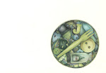

47 comments:
Definitely with the writing! That's what makes these drawings so great!
The text works but only if it's the RIGHT text. This is the right text.
I love it with the text. It doesn't distract at all. Actually, it leads the eye around the page weaving in and out of all of the small things. It feels kind of like digging through a treasure box...look at this neat thing...oh, I love this one...wow, take a look at this....
I personally love the writing under the drawings...it makes it fun as well as interesting!
Without it, honestly I am not sure I'd have known what the shavings were of...soap? Pencil? Wood?
Very well done, love it!
With the writing - the writing drew me right to the small blue thing. Love the detail and enjoy looking at each little thing.
How long did it take you to do it?
I prefer it with but at least partly because I love the song. I wish that I could draw that well - I guess I should practice, and small things is *my* thing - I love to draw small and detailed! You inspire me!
natalief
Well, I just love your lettring Andrea, so I like it better with the title.
I didn't know it was a song--are you doing a series based on music now?
just to "second" everyone I think the text works very nicely with your wonderful drawing
I love it with the text, exactly like a box of memories. I only found your blog last week (via Molskinerie) and I love it!
I'm amazed and awed by the discipline of your drawings, wish I could muster some more in my own sketches. I'm looking forward to more!
very nice
The text! That wonderful handwriting adds to the whole -- and definitely the text under the drawings too, else how would i have known that it was a, er, toenail clipping ...?! :)
Thanks everyone.
I was refering to the title - I often wonder about this as I use text within quite a few drawings. I'm still undecided as I think I prefer it without. I love the the little titles of the individual pieces though - I don't think you'd know what half of that stuff was without it! Especially the toenail clipping!
Debra, thanks, that's exactly the response I was trying to achieve.
Kath, it's funny but loads of my post are music related (although I'm not commitine to a 'series'!). It's usually something I'm listenening to at the time. I heard this song on the radio and hadn't heard it for years - I immediatley saw this picture in my head?! It's by Suzanne Vega and the line is "today I am a small blue thing, like a marble or an eye.." I was thinking of putting a 'NmaeThatTune' tag on the music related posts - I just like to see if people recognise the lyric. Sometimes they do, sometimes they don't.
Thank you al for the lovely comments.
Well, I'll be the odd-man-out and admit - in this particular case - I like it better without. It drew my eye to the blue thing directly, whereas the one without the writing, my eyes had a field day roaming from item to item until I hit the blue one. In any event, this is a really fun piece!
I like the mystery of the blue thing being blue, what that connotes etc. Maybe it makes the viewer think more about the meaning of your drawing rather than handing it them on a plate. That said, your writing is blissful and can often finish the piece...with the right words.
T
Love it! And I agree with Andrea. I love typography, especially hand done stuff so I might be biased... Just a quick note to answer your question about the AOI - I'm not a member, but I do read their forums. I'm not sure if its worth it unless you're actually doing paid work. If I get on a BA course then I'll definitely consider getting a student membership.
well, i would prefer this one without the title (but of course with the little text between the individual items).
though the text itself looks very nice, i feel that it somehow "breaks" the "whole" look of the rest. boy - writing about this in english is very hard. did you understand what I mean?
Goodness, I never saw so many small things. The little blue is just perfect and I would leave the text as is--it's perfect.
I think the texts adds to it in this case. Love your blog, just linked you! Cheers
This is one of the coolest drawings I've ever seen! I keep going back to it and noticing more. It's like one of those games where you try to fit as many items as you can in a matchbox. It also reminds me of a tin my gran had full of old watch parts and other random doodads that I loved to play with. The one blue thing (marble?) is a stroke of genius! Oh, and I like it best with the title on it.
I love it, and my vote goes to with. I recognised the song title after a bit of mental searching - haven't heard that one for years! :-)
I started a grid of "small food items" a while ago (comes across as a pretty stupid idea now I see it written down) and gave up after 2 items! I have to face it: I'm a Westerner ... Most of my food isn't small!!
Thanks guys!
Ryan - I'm with you actually I prefer it without. Ksklien - I agree, and your English is pretty damn good!
Thanks Mithi and I hope you get on that course. And Emma - the tin with watch parts sounds fabulous. You should draw it!
Cheers for the lovely comments everyone.
I vote with!
I vote with the title as it is an extension of the small print that weaves around the rest of the drawing. Man I love these works that you are doing!!!!
Wholely moley!
What a great collection....some of my favorites: the nail clippings (though I'm slightly grossed out), rice and clue pieces. You're so creative.
i love it! it makes me smile looking at it and reading the text. It's wonderful and turns it into a story illustrated with beautifully drawn objects, LOVE it!
I like it with the writing but it's amazing either way!
It's an amazing illustration - I recognise those cat biscuits! ;) It's really fun to look around. I like the text I think, it's not out of place with the text throughout the drawing.
I like it with the writing - partly because I like the link to the song which I wouldn't have got so readily without, and your writing is lovely. It's a fantastic drawing.
Thanks guys!
Suzanne - the toenail is definatley gross!! Once I got it in my head to include it I just had to put it in! It grossed me out just doing it; but it is the object that got the biggest response. Sorry.
Cheers.
Wow, 1st Welsh blogger I have found!
Great drawing Andrea, I've only seen a couple but when I have time I'll look at more. I'm in Scotland by the way. And one of my all time fave UK holiday destinations is the area around Harlech.
Oh, And I forgot to say, small blue thing, that song was hummed all through my 1992 college exchange to canada and inspired lots of my personal artwork and work with writing in it so you've brought back a flood of VERY happy memories with this post!
(as I sit here I AM a small blue thing, teal trousers, turquoise cardi, baby blue scarf - you can see why I've always related to that song and why I love that drawing of yours)
Holy moley! Yes -- keep the writing! This is really just fascinating, and well worth the time spent!
I may well be a non-conformist, but I think this piece looks much more nicely composed without the text at the bottom. Having said that I love your typography, it's beautiful.
I love it when text gives images like these a sense of context and maybe makes you think about them in a different way.
Yes, keep the writing, it adds context. This is so impressive, I'm just speechless.
You have a real knack for coming up with inventive concepts for your drawings and there is so much to see in them that I'm drawn to revisit them again and again. Came back to peruse this one for a third time and have just caught another Joni reference! :-)
Wow thank you all - I'm overwhelmed by the response to this one.
Cally - there are a few other Welsh bloggers out there although I don't know too many myself. I've come across quite a few Scottish though, including some visitors here.
Thank you all for taking the time to visit and comment.
EJ - both sides now???
Andrea - I have just journeyed around your page looking at every little wonderful artifact. You are a clever thing! ( I'm behind at looking at people's blogs -sorry if this is late!!!) Jules
Andrea - "Both Sides Now", indeed.
Every time you post a new image I want desperately to steal the idea. LOL
LOVE your collections....awesome job...and I like the one with the writing on the bottom best....but I like all the collections....what a great idea! and such perseverance!!!
Thanks guys! I've never had so many comments!
I love it! The text must stay. It adds even more excitement to your treasure trove of sketches.
Love this collection of small things. And the writing just caps it off beautifully! It all makes sense.
I was just scrolling through your page and noticed this post has 43 comments...are you kidding me????? Wow, you're really famous. Here's to comment number 44!
Cheers guys!
I know, Suzanne, it's mad isn't it? Funnily enough this drawing didn't make such an impact on Flickr - but the Moleskine buttons got a huge response on there. It's always interesting to see the difference between both places. This of course makes it my 45th comment!
Thank you all.
My preference is sans writing at the bottom. I think this marvelous piece has greater hold on the viewer if their eyes are taken on a journey of self discovery as they wander around the drawing. I admire the tenacity in finding all these pieces. Overall a job you should be really proud of.
My sister Mónica made in china a 'small blue thing' that represents someone "with my knees against my mouth, I am perfectly round". I'd like to have my camera here to show it to you. Maybe tomorrow.
[By the way, it is better with the writting.]
Post a Comment