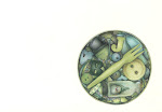
I wasn't going to post this but I was kinda persuaded to. I was very happy with the line drawing, then I went and butchered it with some terrible coloured pencil work.
I fail to see where you "butchered" this. It looks great to me - nice highlights and shadows and your signature line work is as perfect as ever. The colors you used are very soft and nicely laid. I'd be thrilled if it was my work!!!
Bad drawing? Uh ... where? I like the whole thing. And I love your handwriting, even when it's not especially elaborate. Your attention to detail is delightful.
Andrea this is just right in my opinion! I love the mix of journaling and artwork - I like the colours and the whole page's compsition. ( and I go to nandos here in London too! - so got very excited to 'recognise' your experience. Jules
I love your style on this one. Nice job. The "Nanolos" and top of the bottle popping out of their borders looks great.
No doubt you had imaging that your colored pencil work would have turned out differently, but honestly I think it works well and fits the style perfectly.
Wow thanks everyone. I'm really flattered by the response; I'm not sure that I share the enthusiasm though. I still cringe a bit when I see this one.
The pencils I used are Karisma colour and they can get a quite waxy (almost like an oil pastel) if you over work them. I feel that I overworked them especially on the bottle.
Thank you all again even though all your kind comments make me feel a little funny!
Please don't be too harsh with yourself. I at least like your picture (not only this one, but actually all of yours) and I think it's great - with or without the coloring. Your style is so neat and so ...cute! What I always wanted to ask you: what kind of CPs do you use for your drawings?
 I wasn't going to post this but I was kinda persuaded to. I was very happy with the line drawing, then I went and butchered it with some terrible coloured pencil work.
17 comments:
Andrea! doing a bad piece of art is not possible with you. They are all beautiful!!
I fail to see where you "butchered" this. It looks great to me - nice highlights and shadows and your signature line work is as perfect as ever. The colors you used are very soft and nicely laid. I'd be thrilled if it was my work!!!
I really like this too! Sorry =8^)
The writing is a great addition and it really looks like it's _behind_ the bottles. Also the big bottle popping over the border; very striking!
Always love to see your work.
`Butchered' it? I think not, Andrea.
Looks good to me.
Don't forget to check (in about three hours or so) whether you're on Aussiejourno's Weekly Blog Awards.
Cheers
David
It GORGEOUS! Especially how nando's stands out of the bottle. I'd be over the MOON if I produced something like that!
Sorry, gotta disagree too! It's great and I love the way the lettering pops out!
Bad drawing? Uh ... where? I like the whole thing. And I love your handwriting, even when it's not especially elaborate. Your attention to detail is delightful.
Hahah, but it's still better than anything I can do! LOL. Well, I love it. :)
Butchered? It's stunning, I absolutely love the whole thing and the pencil work is great. LOVE the page!
I don't think you butchered it either. I LOVE the whole composition of the page with the writing behind the drawing. Beautiful!
Andrea this is just right in my opinion! I love the mix of journaling and artwork - I like the colours and the whole page's compsition. ( and I go to nandos here in London too! - so got very excited to 'recognise' your experience.
Jules
I love your style on this one. Nice job. The "Nanolos" and top of the bottle popping out of their borders looks great.
No doubt you had imaging that your colored pencil work would have turned out differently, but honestly I think it works well and fits the style perfectly.
Wow thanks everyone. I'm really flattered by the response; I'm not sure that I share the enthusiasm though. I still cringe a bit when I see this one.
The pencils I used are Karisma colour and they can get a quite waxy (almost like an oil pastel) if you over work them. I feel that I overworked them especially on the bottle.
Thank you all again even though all your kind comments make me feel a little funny!
Please don't be too harsh with yourself. I at least like your picture (not only this one, but actually all of yours) and I think it's great - with or without the coloring. Your style is so neat and so ...cute!
What I always wanted to ask you: what kind of CPs do you use for your drawings?
butchered, au contraire. I love this and I really love your writing as background!
Looks great to me! I like the texture of the cp and the texture of the writing in the background.
I LOVE it! It's just great!
Post a Comment