Showing posts with label step by step. Show all posts

Saturday, October 22, 2016

how to make an urban sketch in ten easy steps

How to make an Urban Sketch (in the North of England in Autumn (i.e. it's cold)) in 10 easy steps;

(Optional step; Turn up to the location and realise you've brought all your inks but no pen. No really (I told you I was a rubbish urban sketcher). Go buy pens)
Step 1. Find a coffee shop with a window seat and a view
Step 2. Have a coffee and sandwich. This is one of the more complicated steps; I'm in the Northern Quarter, of Manchester, so will have to decide between ten different coffee beans, made in fifteen different ways, then there's the bread...sour dough, brioche, rye....
Step 3. Make a mess of the table
Step 4. Ah shit. Why did I put colour on it?
Step 5. Have another coffee. And a Danish pastry. Try to hide the mess you've made of the table when they bring it over.
Step 6. Add lettering to try to take away the focus from the awful colour work
Step 7. Pigeons
Step 8. Scrub the table then go outside and take the obligatory out of focus urban sketcher photo, whilst holding your book in front of the building with one hand and trying to take photo with the other hand whilst worrying that somebody is going to snatch your phone.
Step 9. When all else fails go shopping
Step 10. Reassess at home over a cup of tea. Followed by either throwing it in the bin or feeling a little bit smug.

Saturday, December 19, 2015

the upside down sketchbook project

 I don't understand how people get bored. It's a complete mystery to me. How is it even possible when there are so many things you can do to amuse yourself? I have a million and one projects on the go that I can dip into when I have nothing else to do. My problem is those projects too often get shelved because I never have nothing else to do.
Here's one of them. I started this a little while back when my friend, designer Emily Pickle, bought me a couple of Chagall and Renoir sticker books. At the same time I'd bought a couple of cheap little sketchbooks that were on a buy one get one free offer. So I dedicated one to copying the stickers. But, copying them upside down
Now, I'd heard about this technique a long time ago, when I first started drawing. I'm sure it was through Danny Gregory but I can't be certain. I didn't really give it much of a go back then. I was too caught up in making everything look perfect, and hadn't really learnt to trust my own judgement. Anyway, I only really started playing around with the technique, properly, a few years ago. Now, I really love it and use it often. Especially with portraits.
So how does it work? Well, it's really quite simple. I'm sure many of you already know, but for those who don't (and being self taught and not having that art school background, I had never come across these techniques before hanging out with illustrators online), here's a quick demo.
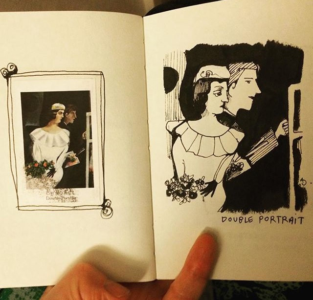
As I said, I was given these little sticker books of paintings from a series by the great painters. I'm not really a Renoir fan, but that really doesn't matter at all. And, as for Chagall, well, although I knew his work I hadn't studied it until now. And now I really am a big fan. I stuck all the stickers on the left hand pages of the sketchbook. You don't need stickers though. You can use absolutely anything as subject matter.
Then what you do is you turn the book upside down. See below.
All I have used is a fine pen and then a thicker pen; like a brush pen, a calligraphy pen or anything with a thicker nib. A marker pen will work just as well although they often bleed through the paper.
I started by making a line drawing. This exercise is all about looking. Really looking. Starting in the top left hand corner and trying to copy, as best you can, the photo or image you're working from. Stop wondering if you're getting it 'right' and just keep looking. Resist the urge to turn it the right way up until you've drawn the whole image in.
THEN you can turn it around. It's never really going to be 'perfect'. There'll always be a quirkiness about your drawing, but I think that's the joy of doing this. I always find I make the eyes huge.
 When I'd completed the line drawing, and turned the book around, I shade the drawing with the thicker pen. There's no reason you can't do all that while the image is still upside down. I just like brining it together like this at the end.
I've since found some more stickers of Japanese art which should complete the sketchbook (after I've shared them out with Emily Pickle, that is).
I should add that your first attempts may look absolutely nothing like the image you are copying. Mine certainly didn't. I've done a huge amount of this stuff since getting into it. But it's amazing how quickly I got better at it and how confident the drawings became. But, I guess that's the same of anything you do.
This one above, is one of my favourites.
One warning; if you do decide to dedicate a whole book to this technique, no matter how much you try, this will at some point happen...

Monday, September 03, 2012

turns my whole world misty blue

An update on this commissioned drawing here. I started step-by-stepping it a little while back (you can see the first stage in this post) but due to some urgent deadlines it has progressed very slowly.
On a personal level this really is one of the most important drawings I've ever made. Probably THE most important. The commissioner (is that even a word?) gave me free reign over everything - subject, size, materials.
Whilst that's the best kind of commission it does present you with a different kind of pressure from working to a brief. But, it also shows an amount of trust that touches me deeply. This image just came into my head as I drove home the day it was commissioned. I have no idea where from. And, I LOVE that.
I've not only been step-by-stepping it here, but also with the person who I am painting it for. I take it to show him at various stages and we talk about it and what it means to both of us. He said it reminded him of Tennyson's The Lady of Shalott (which again touches me no end). Not only do I love that poem but my all time favourite painting is Waterhouse's version - SEE.
When this image popped into my head it came fully formed. I knew exactly how I wanted it to look. I wanted to create a piece of work that paid the same kind of attention to detail that the Pre Raphaelite's would have. It's a big piece too; over A2 in size. Which is why it's difficult for me to share with you - excuse the rubbish photographs.
The deadline for this piece is the 17th of September, when it needs to be finished and framed. So, basically what I'm looking at is two weeks, whilst working the day job and other illustration jobs, to create my Pre Raphaelite masterpiece.

No, need really. I'll say it to myself; good luck with that!

Saturday, July 07, 2012

slip inside the eye of your mind

I haven't done one of those step by steps for ages, so here goes. This is a really big piece. Way too big to scan - which is why I'm posting these pretty rubbish photos. It's my biggest piece yet. And, without being dramatic (here's where I am going to be dramatic) I do believe this is probably the most important drawing of my life. So far.

It is a commissioned piece. And it's really very personal. Maybe I'll talk about all that as the drawing unfolds. Maybe, I will. I haven't decided yet.

Anyway, this is step one. I want this drawing to be Pre Raphaelite in it's attention to detail. And, here's the thing, it's not just a drawing. Oh no. I'll be cracking out the paints for this one. It told me it should be a painting and I'm listening to what its got to say. All the way.

So as I said, here's step one. Over the next few weeks it'll come to life. Please come back and see it's progress.

Wednesday, February 16, 2011

where sleeplessness awaits

So I started this drawing about two or three weeks ago but unfortunately it's going to have to be put on the back burner for the next few days as a new, more pressing deadline has emerged from nowhere.

This is one of the most ambitious drawings that I've undertaken yet. It's on A3 paper which is double the size I normally use. Plus it's full colour. Thus far it has taken approximately 20 hours.

Anyway, I thought I'd take this opportunity to show you how I make these big mad drawings as it is a question I'm asked often. In the past I've been asked if I set up the compositions or whether I draw from a photo. The answer to both of those questions is no. I almost always draw from life.

What I do do is start with a couple objects (in this case the tram ticket, the Mary and baby Jesus and the seahorse) and then add the rest around them. I place the other objects on the paper, mapping it out piece by piece. It's almost as though the composition works itself out. I love drawings like this. I love the way they reveal themselves to me, the way they unfold in front of my eyes.

Saturday, July 24, 2010

how to draw a shoe

Over the past few years I have worked through many different processes, when drawing from still life, to get to the one that I am happy with. As I'm self taught it's been a process of elimination to find the ways that work best for me. I have narrowed it down to a couple of methods actually. I'll show you both in the next two posts, and demonstrate with my favourite subject matter; shoes.

 Above are all the tools I've used. They are; a cartridge paper sketch book; tracing paper; pencil; rubber (I believe that means something different in the US?!); three blue ballpoints; one red ballpoint. I want to stress at this point, because I'm asked so frequently, I use ANY kind of ballpoint pen. No special makes or brands. Any. As long as they aren't blotchy I'll use them.

Method 1
Step 1. I am pretty obsessive about getting the shape 'right', so if I'm sketching something, for eaxmple an Adidas trainer, I will do the sketching stage on tracing paper. I realised, a while back, that I do not have any 'sketchy' books as such. I only ever produce finished drawings. I do, however, have huge amounts of roughs on tracing paper. Doing things this way means I can work on the shape I want to achieve and then transfer it easily to paper. It also means that, if I should want to, I can reproduce the same image (in different mediums). Which is something I do quite often.
Step 2. When I've got shape I want I transfer it to paper. In the image above you can see the ballpoint outline. I would obviously start with a pencil outline, but the scan I did for that was rubbish - you couldn't see anything. So when the pencil outline is put down on the paper, I go over it faintly with a ballpoint.
Step 3. I have started to add some shading (values?) to some areas. I work out where this shading should be by observing the shoe and where the shadows and light fall. Excuse me if all this sounds really patronising, it's not meant to. It's just how I have learnt to draw. Step by step.
Step 4. Here comes the cross hatching. This is the part where I feel I can really get into the zone with this drawing. I love this bit. The shoe is starting to come alive, and more texture is being added through the hatching.
Step 5. A continuation of the last step. More building, more hatching, more texture. Also at this point I'm starting to add the detail. That's another bit I love doing.
Step 6. The finishing touches. My most favourite bit. Details, a bit of extra hatching and a splash of red. In this drawing the final finishing touch was to outline the shoe with a bolder line, using a ballpoint that has a bigger nib.

I'm sure there are more sophisticated methods of creating drawings but when you haven't had the training you don't get to learn them. That's OK with me, though. I found my way of doing things through practice.

Check out THIS LINK to see the other method I use to make my shoe drawings. Hope it's useful in some way.

Wednesday, April 21, 2010

the world is turning

Unbelievably, people sometimes ask how I me how I make my drawings. Here's a little insight. Actually, not so little. Yes, this is the biggest blog post in the worldiverse.

So, as you can see, with this one I started by mapping a little bit of the drawing on the page. Not too much, just somewhere to start, because I like the rest to unfold. I like the drawing to reveal itself to me.
Contrary, to popular belief, I actually am rather inpatient and usually want to jump right in. So already I've started drawing the bits and pieces. For this spread I am treating each card as an idividual drawing. I'm mostly using colour ballpoints and colour pencil. Ah, Bangladesh Airlines. Now that was an interesting airline. And, an interesting flight. It was cheap, though. VERY cheap.
Actually, it was the red and yellow of the Bangladeshi baggage label that first appealed to me when it came to turning this collage into a Moleskine drawing. I love the pop art colours. Ooooooh, British Columbia and Alberta. Probably, still, after all this time, my most favourite place I've been lucky enough to visit.
I know, drawing wise, this kind of subject matter isn't much of a departure for me, but this drawing in itself was certainly challenging. Emotionally speaking, that is. I do believe this was one of the most emotional drawings I've ever created.
Obviously it took quite some time to complete, and it was spending all that time with all these memories. All the places and people I've left behind. All the things I've done. Some joyous and others not always easy to be with.
And there are times and places and people I'd never have remembered if I hadn't made this drawing. Most of these cards and tickets came from a five year period between 1991-96. There was so much I'd forgotten about (probably a selective memory lapse). But still, I think there is something really symbolic, I suppose cathartic about laying all these things down on the paper.
Back to the drawing, and the latest addition - the green Koh Phanghan card showing a map of the island is probably my favourite bit. Not sure why that is, but I do enjoy drawing those little details. I love the handwritten phone number on the card, and the food stains. It's those kind of tiny details, that you might never have noticed, that really float my boat.
By this point of course, there are things that are starting to annoy me. I'm not happy with the addition of the comic strip and that Jasper Taxi card is really starting to get on my nerves. I am happy with the texture on the pink card for SP Resort, though. I did that with pink pencil and ballpoint. I think it works. And again, I love the yellows, which were both done with a yellow ballpoint and finisheded with a yellow pencil.
What the hell and how the hell did I get a card from a Canadian Mountie officer? I was a bit wild back in the day but I don't remember getting arrested! In Canada! By a Mounty! Surely that is something you'd never forget. And ,where on earth is Nyah Village Caravan Park?
After a little Googling I find that Nyah Village caravan park is in fact in Australia. I've never been there so how did I get that card? Who gave it to me? I like these kind of questions, even though they'll probably never be answered.
By this point I really want to finish this drawing but I keep obsessing over what should be the last things to be added, and how should they be placed. The best thing to do at that point, I find, is to just stop thinking and put something down . Anything. When I started this drawing I never imagined that my own little ballpoint card would turn up, it's next to the Vancouver book store card. Do you know that I had four days in Vancouver and on the first evening I went out for a Chinese meal and spent the rest of the stay with violent food poisoning? So basically, I didn't go out of the motel. The motel bathroom to be specific. Of course, there is absolutely no reason why you would know that.
Now I must stress here, I did NOT draw the picture of my mother and father. I am not that good! This photo, though, was the reason for making this drawing. I really wanted it in my Moleskine. Forever.
I deliberated for ages where I should place the photo. It was originally meant to hide the Vancouver book store card, but the Jasper taxi card was annoying me so much it ended hiding that. Unfortunately, it hid some of the pink card but, again, I think there is something symbolic about what is lost from the drawing. I don't know what it is symbolic about it, but no doubt it'll come to me one night when when I've just fallen asleep.
So there we go, that's it. Finished. Finito.

If you've liked this, you might like to order my new zine - the travel Molezine one. This is one of the drawings featured in it. You can buy it HERE for a very small price. You can be guaranteed that a whole lot of time, energy, emotion and love went into it. Thanks.