
Now once we've set our theme for our Dr Sketchy event the idea for the poster image pretty much comes to me straight away. Sometimes without even having to think about it. Really, it's just there. I see it - the whole poster - fully formed. I then just need to put it onto paper.
Our next event (next Saturday, at the Greystones, Sheffield!) will be a celebration of dance. We have performers from different genres of dance modelling and, erm, dancing for us. We have a belly dancer, a breakdancer, a bhangra dancer amongst others. So, already I knew I had to get that info into the drawing. The first and original thought was of the kind of drawing in the image above. I think it's important to go with that initial idea if it has presented itself to you. I love those 'consequences' drawings. I've heard them called other things and somebody once told me that they were known as 'exquisite cadaver' drawings. I think that's such a great name, which conjures up all sorts of weird and wonderful images, so I'll be sticking with that.
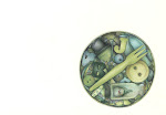
I made a few exquisite cadaver sketches, like the one above, to try it out. To see if it worked. I'll be honest with you, I think the trial run above is still my favourite. I guess that's because it was the most spontaneous. Then when I'd got one that I felt would work as a poster image I sketched it out onto a 'proper' bit of paper. I always add the image first, leaving room for the text. Sometimes I will play around with where I want to place the image. I did with this one - I tried her on both sides of the page and central before settling on this composition.
For the text I always quickly research (Google) posters or fonts until I find something that fits. For example, I'll Google 'Bollywood poster fonts' or some such thing. This one was a combination of various fonts because of the variety of dance genres. When I find a font I like I loosely copy it. I don't measure out the letters, nothing technical happens, I just copy it by eye (is that even a saying? It looks odd now it's typed out). I don't want it to look exactly like the fonts I find. I want it to be my own version of them.
Anyway, that's a little (ish) explanation of how I create my posters. Now anyone want a poster illustration? I'm for hire. I'm always for hire.


3 comments:
Yes, I MUST HAVE a poster.
Jill
xxx
this is wonderful to read..I always loved to get books on posters etc.....I liked the work looking folded very much but like the final, too. The lettering on the left works good for eye travel to the art work...what a creative idea !!!!
Thank you both, ladies.
Post a Comment