Friday, March 27, 2015

Museum Week

 If you've followed my work in the past, you may know that a favourite subject matter of mine is collections. I've drawn collections of keys, badges, matchboxes, pens, buttons and souvenirs to name but a few. I've drawn souvenirs of all kinds, like in the drawing above, which comes from an entire sketchbook of collection drawings. Well, recently I've been commissioned by Greater Manchester Museum Group to create four drawings based on their collections from four of their museums.
I'm so thrilled about getting this gig. I've always wanted to draw museums' collections. I used to dream that I'd get a job cataloguing them all. It would be my perfect job, but unfortunately photography happened and then computers and so the call for museum collection illustrators and cataloguers waned. But, anyway, now I have the opportunity. My problem is how do you make just one drawing from each museum?
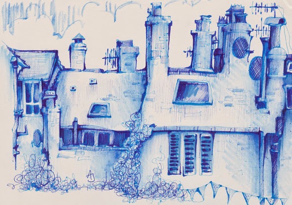
Well, firstly we narrowed it down by choosing the four museums from Greater Manchester's 21 venues. The first was Stockport's Hat Works Museum which is the building in the picture above. I already knew of, and love, this place. In fact we did a sketchcrawl there just a few weeks ago. It contains everything you need to know about hat making and the most amazing hats. But, not only do I get to visit the museums, but I also got the opportunity of looking through their archives and storage. This has been such a privilege, rooting through the stores, holding history (and antique top hats) in my hands.
 The second collection I'll be drawing is the Egyptology collection from Bolton Museum. They have an impressive collection of  Egyptology artefacts. Unfortunately, I didn't get the best photos from that trip but I did get a sketch of a dinosaur before I left the building!
 My third collection is from the natural History collections of Oldham Museum. I spent the best few hours with the curator, down in the cellar archives, surrounded by so many treasures of nature, whilst being educated on bugs and butterflies and birds nest. Actually, that too has been another joy and privilege of this whole experience, learning about, not just Natural History, the social history of this region and about the collectors. Learning from passionate people.
Again, I managed to sneak some sketching in before leaving the building. Well, what else do you do when waiting for the rain to stop?
 Today was my final visit and final collection. For that I went to the Museum of the Manchester Regiment to view their medal collections. I wasn't quite prepared by how touching an experience that would be. I shed a tear or two reading the heart breaking stories of the soldiers who lost their lives.
So, that's what I'm working on right now. My drawings were commissioned by the Museum Group for a new online shop they are building, which is coming soon. Very soon. Which reminds me, I don't have time to sit here blogging, I've got (a lot of) work to do.....
 
Oh, and unbeknownst to me, and quite coincidentally, this is actually Museum Week 2015. So Happy #MuseumWeek one and all. Go visit a museum because museums are great places. 

Tuesday, March 24, 2015

something old something new something borowed...

I've a few original artworks, in my Etsy shop, going cheap.
The drawing above is brand new. I did it while waiting in the car park, in a local village, Hayfield, here in Derbyshire. It's the village where the BBC production called, funnily enough, The Village is filmed. Throughout the filming Hayfield was transformed into a village from 1914. Which basically means that they hardly did anything to it. It really hasn't changed much in a hundred years. 
Below, is an oldie.
You can find them both, and some others, HERE.

Saturday, March 21, 2015

a bit about creating poster artwork

Amongst all the other illustration work I do, I also co-run Dr Sketchy Sheffield and, so, being the sketching half of the team (my co-running partner is from the performance arts), I create the poster artwork. It's one of my favourite things to illustrate. Because it makes me feel closer to the poster artists, from days gone by, who's work I adore. I wish there were more call for poster artists. These days it's all done digitally so I like to buck that trend with purely illustrated posters (and I wouldn't have a clue how to do it digitally).

Now once we've set our theme for our Dr Sketchy event the idea for the poster image pretty much comes to me straight away. Sometimes without even having to think about it. Really, it's just there. I see it - the whole poster - fully formed. I then just need to put it onto paper.

Our next event (next Saturday, at the Greystones, Sheffield!) will be a celebration of dance. We have performers from different genres of dance modelling and, erm, dancing for us. We have a belly dancer, a breakdancer, a bhangra dancer amongst others. So, already I knew I had to get that info into the drawing. The first and original thought was of the kind of drawing in the image above. I think it's important to go with that initial idea if it has presented itself to you. I love those 'consequences' drawings. I've heard them called other things and somebody once told me that they were known as 'exquisite cadaver' drawings. I think that's such a great name, which conjures up all sorts of weird and wonderful images, so I'll be sticking with that.

I made a few exquisite cadaver sketches, like the one above, to try it out. To see if it worked. I'll be honest with you, I think the trial run above is still my favourite. I guess that's because it was the most spontaneous. Then when I'd got one that I felt would work as a poster image I sketched it out onto a 'proper' bit of paper. I always add the image first, leaving room for the text. Sometimes I will play around with where I want to place the image. I did with this one - I tried her on both sides of the page and central before settling on this composition.

For the text I always quickly research (Google) posters or fonts until I find something that fits. For example, I'll Google 'Bollywood poster fonts' or some such thing. This one was a combination of various fonts because of the variety of dance genres. When I find a font I like I loosely copy it. I don't measure out the letters, nothing technical happens, I just copy it by eye (is that even a saying? It looks odd now it's typed out). I don't want it to look exactly like the fonts I find. I want it to be my own version of them.

Anyway, that's a little (ish) explanation of how I create my posters. Now anyone want a poster illustration? I'm for hire. I'm always for hire.
 

Monday, March 16, 2015

i drew a car


The Jaguar E-type has recently been voted Britain's favourite classic cars in this poll. I was commissioned to produce a drawing of it. It's not surprising that it is in the number one spot as it really is a thing of beauty.

I used pencil (a soft thick 4B) and marker pens, to make this drawing, both of  which are drawing materials that I've recently started using. I've never been much of a pencil girl. It doesn't really do it for me, but I kinda like these soft pencils now and again. The marker pen has been a revelation and I can't get enough of them these days. I did all the darker tones and areas with the markers, and it struck me that at one point I would have filled all that in with tiny cross hatched fine lines. Just the thought of doing that, now, brings me to tears.

You can see the rest of the list of Britain's favourite cars, and if you vote you can actually win this drawing HERE.

Wednesday, March 11, 2015

the clay pot against the iron pot

A little while back I was asked why my book was more expensive in my shop as opposed to on Amazon. It is a good question. It is a fair question. I tried to answer it in an illustration. How else?
It is an issue that faces all of us that run a small business. There's no way of competing with the big guys, no way at all, there is no point in trying. But we do have an advantage over them and that is the service we give.
I am not making big bucks off my book, hell, I forgot to even mention, in this illustration, that I have to buy my book off my publisher in the first place - as well as the currency conversion and bank charges that that entails too. That's before the, above, process even begins. No, I'm just scraping by. Always just scraping by.
But when you do buy from a small business or independent seller/artist you are also supporting them in creating their work. Thank you for that. I really don't mind where people buy my book from. It is an honour that they do buy it at all.  
I'm glad I was asked this question. It's an important one and it gave me the chance to try and answer it. Quite coincidentally, I was chatting with my publisher, whilst I was in the middle of this drawing, about the price issue when he said "in French we say 'le pot de terre contre le pot de fer'. It's a kind of  David and Goliath" and that's how this drawing got the title.

Sunday, February 22, 2015

a strange dust lands on your hands

This week my class, at Sketchbook Skool, has come around again. The course is called 'Seeing' and is about, well, seeing. Really looking at your subject and perhaps seeing all those details that, if you weren't drawing, you'd never notice. I try to demonstrate this through one of my collection drawings.
Here are a couple of my drawings of one collection - my friend's collection of keys to be precise. They belonged to her father who had all sorts of collections. Most of these, I believe, were from model railways and clocks. I love keys. I love the symbolism of them and all the stories they could tell and doors the could unlock. I'm particularly happy with the drawing below. Don't know why. I just like it.
If you're interested, you can find out more about becoming a student at Sketchbook Skool HERE.

Saturday, February 14, 2015

read all about it

 My brand new zine is hot of the press and on sale. This cut out and put together tiny little newspaper is for sale HERE.

Monday, February 09, 2015

will draw for money

Thanks for the interest in getting your own classified ad in my new zine. The spaces are now full. Sorry, if you didn't get one. You must be quicker next time!

This little zine (and I mean little) is probably (definitely) the most complicated layout I've ever worked with yet. It was born out of an idea I had when I saw some of the mini zines that people are making. I really wanted to have a go.
It also had to cheap to make. Very cheap. Basically, in true tradition of zine making, it had to be produced with a photocopier. A photocopier and a bucket load of creativity.

I spent my childhood making stuff like this; tiny little books. I haven't made anything on this scale since then. The pages are all double sided too, which complicates things further. It's been a concern, after doing all this work, that when it was all folded up and cut out it might not even work.
So, I crossed my fingers and had a trial run....and phew! It works. It actually seems to work.
I'm hoping it'll be for sale in a day or two. Please come back if you'd like a copy of my first  tiny teeny weeny ziney.

Saturday, February 07, 2015

at the junction


On Thursday evening I went to an Etsy team event in Manchester. For those, not in the know, if you have your own shop on Etsy you are also a part of a huge worldwide community of Etsy shop keepers. Amongst that community there are a whole host of teams - places where traders can connect and discuss what matters to them. And, sometimes events and meet-ups come out of those discussions. So, I went to see what goes on at these events - I've observed from the outskirts until now - and, to sketch the event - which, too, could be seen as observing from the outskirts.

The team in question is Etsy MCR. Based in Manchester (obviously), this is a really pro active team of Etsy traders. Over the evening we had talks from members, local creative businesses and a live Skype chat with Etsy UK HQ. It was really inspirational. I've very much come to realise the importance of getting our and about, networking and connecting with other creative folk and small businesses recently.
This realisation has become heightened, of late, now that I've finally, after all these years, taken the leap and given up my day job. Eeeeek. Woohooo. Arrrgh. YAY. Shit. Oh.Oh dear. Oh yes. Okay. Help. Yay. Eeeek. Woo-fecking-hoo. Yes, that's pretty much what's been going through my head since doing so. Anyway, more of that in another post.
Back to Thursday. And, back to the gorgeous setting of Sugar Junction, in the wonderful creative Northern Quarter of Manchester. And back to Etsy. I'll be honest, I've never made the most of the Etsy community, teams or the tools they have to offer (I've never really had to as I've always had that comfort of a monthly wage) so this has all been bit of a revelation.
It heartens me to know that there are so many people beavering away, turning their passion into a small business, and understanding all those issues and concerns that I too feel. I really do sense a sea change in the way people shop and they way people think about where, and why, they shop these days - since the recession. It's been a long time coming and I guess it takes something like a recession to question those things.
 This is the time, if we want it, for the whole shop local ethos to flourish. Shop local and shop independent that is. Shopping in a way that puts money and investment back into our communities - whether that be our local communities, and high streets, or the worldwide community of small independent businesses who are doing all they can to keep their head above water.
Actually, this, just might have, unintentionally, turned into a post about giving up the day job. Sorry about that.

Friday, February 06, 2015

hot off the press

Calling all creative folks, with something they want to promote/advertise/flog. Ever advertised your new book/project/blog/Page in a newspaper or magazine? Of course you haven't. You're a creative - you'd never have the money for that. And anyway, why advertise in a big corporate glossy magazines with huge numbers of readers who, quite frankly, do not deserve to see (ignore) your ad? No, what you want is to be seen by a lot fewer people, but the right people. What you want is to advertise in a small self published, cutting edge, do-it-yourself ethos zine.
What you get; a small (tiny - this is my tiniest zine yet) unique hand drawn advertisement. The space is approximately an inch squared. Just enough room for a logo, a web address, and a few of words.  All for five British pounds. Above is a couple of pages from my How To Draw Like a Loon zine. Your ads will be similar even though the zine layout is totally different.
Spaces are very limited, and as I'm hoping to get this zine to the press on Monday, time is limited too. Take advantage of this offer now. Interested? Get in touch.
Support self publishing. Support a fellow creative to keep on creating.

Monday, February 02, 2015

can't talk now I'm sketching a band

Here's another sketching opportunity that came my way recently, I got to go into a studio to sketch band. A local band, including a couple of members I know. I realised that I've never actually been into a studio before. I could have spent hours, days, in there drawing all the equipment.
 I have some larger drawings that I made in my Moleskine sketchbook, but these drawings I made in a cheap little pretend Moleskine that was about a quarter of the price. I'm not somebody who moans about the Moleskine sketchbooks being expensive. I actually don't think they are. Or, at least, for me it's well worth the price for the amount of time, effort and love I put into filling them. But, there is something to be said for these cheaper sketchbooks. You're less precious about them and about wasting the paper which gives you the freedom to make different kind of drawings. More sketchy, I guess.
Anyway, here are some sketchy sketches. And, here, if you are interested are the band, Sharma. If nothing else just check out this first track. I think they're good. Really good. You can watch them HERE.

Wednesday, January 28, 2015

this week I be mostly using


 A little while back, probably through one of my poorer periods (one of my even more poorer periods), I decided that I would not buy any more pens until I'd used some of the many thousands that I already have. Well, okay, so yes, I have bought more - but just the black, brown and blue fine liners I use a lot of - but for the most part I have kept to that self imposed challenge.
The best thing about it is that it's making me use things I wouldn't normally choose to use. You know, the stuff that isn't the black, brown and blue fine liners. I've used lots more colour felt pens, markers and other stuff I can't think of right now. Things, when  bought, I thought I'd use all the time. They'd push me in new directions, etc. Then they sat in pencil cases and pots and on shelves and I never touched again.
Many moons ago, way before I'd taken up drawing, I got these fountain pens. I went to the Artist & Illustrators fair in London and was talked into spending a huge amount of money on these Pilot Parallel pens and a load of coloured inks. I thought I'd use them for calligraphy. Then I put them in a pencil case and didn't even look at them for a decade.
Now, I've always been a big fountain pen fan. Somewhere in this house I have a box full of old-school fountain pens, inks and nibs. I have always loved playing around with my handwriting and there's nothing better than a fountain pen for that. So rediscovering these modern fountain pens and the variety of lines they make has been a joy.
 And, what's more, it has pushed me. Next time you have a craving for a new pen why not have a dig around in your drawers (!!!) and see what you can find. I really love the results and the marks I've been making with these. Next stop is those scratchy old fountain pens that are lurking around just waiting for me to dig them out.
 So, hands up, who's gone and ordered the Pilot Parallel pen now? That wasn't the point of this post, remember?!
 
And, by the way, these little Toulouse Lautrec inspired drawings are up for sale dirt cheap. Yes, I'm going through one of my even more poorer periods again. get them HERE.


Wednesday, January 21, 2015

the silence of a falling star and other juicy quotes

Day Four of the post three drawings for five days challenge. Yes, it's taking longer than five days. Way longer.
Today, I chose these three drawings because they are all linked. Obviously, they are, but I thought I'd expand on how they are linked. And, how I work sometimes. So yes, of course, I've worked with the same palette here. Incidentally, blues and browns are my favourite colour combination. I just think they work so beautifully together. They also work great with the cream Moleskine paper which is the sketchbook I worked in here.
I often have a few sketchbooks on the go. Quite a few in fact. A lot are Moleskine, but not all. These days I'll draw on anything and everything. The top page is from what I call a 'spare sketchbook'. It's the kind of book that doesn't have a specific theme, it's just somewhere where I dump all of my thoughts, play around with images and compositions, practice my handwriting, file all those lovely juicy quotes and lyrics - that I happen upon - for future reference and make lists. Lots of lists. I love these kind of books. Everyone should have this sort of sketchbook. I can guarantee if I look through this book (this one is about seven years old now) I am reminded of and inspired by all sorts of things I'd forgotten.
At one time, when I was going through a drawing funk (they don't happen anymore by the way) and whining about it on my blog I was offered a piece of advice that I've never forgotten. I remember who gave me the advice too. It was Felicity Graces who some of you may know - although she doesn't draw, or at least, post her drawings anywhere near enough these days. Anyway, where as other people had been telling me to look through the work of my favourite artists or contemporaries, Felicity said definitely do not do that but look back through my own back catalogue of work. It was good advice. That's where you reconnect with what you love to do and the things you love to draw and why you love to draw.
So, that's why I recommend having a 'spare sketchbook'. You'll find so much in there too relight your fire. And, so to these drawings. Both of the two (bottom) drawings came about from developing themes I played around with in the top spread. By taking the notes and ideas and pushing and pulling them in all directions.

And, another thing, the envelope spread is what can happen when something goes wrong on a page; collage. The best way to cover all of your mistakes.

Monday, January 19, 2015

just a little green

These are my Day Three sketches of the Post Three Sketches in Five Days challenge.

Today I chatted with Koosje Koene, one of the founder members of Sketchbook Skool, on Skype, and we caught up on all sorts of things that had been happening, for both of us, since I went to Amsterdam last year to film my classes for Sketchbook Skool with her. It was good to talk. You know when just chatting with another person who has the same interests and passions as yourself can give you a boost? It can be uplifting and, well, the conversation left me feeling all inspired. So, it felt fitting to post these three sketches, that I made whilst I was there, in Amsterdam with Koosje, today.

If you are unaware of Sketchbook Skool (is there anyone who hasn't heard about it yet?), well, it's this online school where all the tutors are sketchbook artists from around the world. An eclectic mix of tutors who are pretty much obsessed with creating sketchbooks. In fact, there's no pretty much about it, they're totally obsessed with creating sketchbooks. And, that includes me! Yes, I'm one of the tutors on the 'Seeing' course which starts on Friday. Still time to sign up. You can do that, and find out more, HERE.