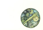
Here are two drawings from the same day and the same place. They are, I think, examples of how a drawing can go either way. I drew them both at a field day and they are of a stall that was a celebration of all things bread. It mapped the story of bread from back in time and from around the world. Very interesting and very tasty.
The top drawing pleases me quite a lot. It's got a touch of the Patrick Caulfield about it (who I absolutely adore). The bottom one is atrocious. Way too much going on and way too overdone.
You win some, you lose some.
Wednesday, October 16, 2013
carry it home in a tote sack
Subscribe to:
Post Comments (Atom)


8 comments:
I like the top one, too.Makes me want to bake some bread...not today.Maybe in winter!
They are the same only different!!!! Do prefer the first one though.
I do not a gree,the second one is not atrocious. But I agree, the first one is better. Actually it's fantastic.
i like them both, the top for its simplicity and color; the bottom one for the fact that you were capturing everything in the moment. imagine if it too was in color....
I like first sketch! Looks amazing!
Love the bakery. Another artist that comes to mind, and who I love, is Stuart Davis.
I think the second one could be salvaged with some areas just pushed back with a shadow effect...you know push and pull to separate it into several areas. It is a lot of work not to try to salvage...Miz Dee
Thank you very much, guys. You are kind. But, I still think the second on is RUBBISH!!!!
Cheers.
Post a Comment