 Click on image to view.
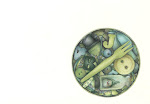
Yes, this probably does look familiar. One of my favourite drawings that I did in my Moleskine, way back whenever, was this spice rack drawing. I've wanted to rework it onto paper and frame it for some time and so Tim's birthday (see last post) gave me a good excuse to do just that. Something to spice up his life - his forty year old life! I like it, although it just lacks some of the spontaneity of the original and, of course, that gorgeous cream colour Moleskine paper.
View my sepia set on Flickr HERE.


16 comments:
Love this! Love reading all the labels and notes between the bottles.
I looked at your flickr collection and they do look well together. Are you going to have an exhbiition sometime, or make a coffee table book or something?
What size are your drawings Andrea?
w.
wow. i love this. love the little "best before" dates too. you have such a way of taking something so ordinary and making it extra :-)
what a lucky friend that tim!
Great work!
I'm not sure if I would have the patience to redo something I'd already drawn!
Love it! I can't resist and I'm going to make a print, if you don't might for my kitchen!
Great work!
I loved this idea the first time around and, contrary to what you think, believe this version boasts just as much or perhaps even more energy than the first. Great job!!!
The expiration dates are an awesome addition!
This is fabulous. I love all the little details. In fact that's probably why I'm such a fan of your work.
OK, well, you are too amazing! I was going to ask if you had it copied onto a single sheet of paper, or if you redrew it. So, I thought I better take a look at both. And yes, you did redraw it! You are just incredible, Andrea! Wow! Fabulous!!
Loved it the first time and love it this time as well. Awesome!
Thanks everyone.
I'm really pleased with this actually - it's grown on me (apart from a bit of lazy pen work in the top right hand corner!).
Wendy, this was drawn on an A4 paper. I either work on A5 or A4.
Cheers for the kind words guys.
You are so clever! Thanks for visiting my blog, and now I get to discover yours! What fun talent you have, and a very consistent style. I will add you to my Links list on my blog! : ) Have a nice day!
-kate : )
Great art work Andrea. Please show us a snapshot when it is framed.
Tim is one lucky guy.
Tim sure is one lucky guy!
Lucky to have a patient and talented friend like you.
Lucky to have collected your works for years (available to buy at reputable outlets! only joking).
This piece is very much a 'signature' work - it is a great example of a theme and style that is uniquely yours. A style that you have developed over the years, constantly refining elements of composition, colour and use of texture. Commentators on your work often mention the steady hand, the patience, the ability to redo a piece! But, I feel it is more an extension of your ability to view the minutiae of the world and its experiences, and to distill it to a few pen strokes on a piece of paper. The same talent shown by the music artists you so often reference.
Much love to you, my dear friend.
Beautiful! I do like the mood of these subtle colors- really draws you in. How long, may I ask, does one of these big ones take you?
Thanks guys,
I actually prefer this one, to the original, now. It's grown on me and looks very nice framed.
Kate, I've added your link too. Thanks.
Martha, the big ones are usually A4 - and they moe or less fill the whole page apart from a little border.
Tim, aaaw, that brings a tear to my eye - just like a sad and lonely kitten would. Thank you.
Cheers!
Post a Comment